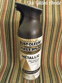
Items used:
- 6 hardboard clipboards
- 2 frames 8"x10" outside diameter with 3"x5" openings
- 2 frames 7"x14" outside diameter with 3"x5" openings
- 1 monogram 12" x 19"
- 1 frame 23"x17" - Empty to surround monogram
- Scroll metal art from Hobby Lobby
- Black and white photos
Am I the only one who struggles with keeping framed photos updated? I love family pics and have tons of them on my phone, yet the framed pics on our walls are usually stuck in time. Our sweet grandkiddos and adorable niece and nephew are growing fast but the framed pics of them were over a year old. Something had to be done!
For the gallery wall revamp, I knew I wanted to work around the foyer table and the lamp that is centered on the table. My anchor was the framed monogram centered above the lamp.
Starting on the right side of the framed monogram, I placed 2 clipboards to the right (one above the other), and added an 8"x10" frame below them. Then I added the 7"x14" frame and another clipboard to the end to complete that side of the grouping.
Repeated the same grouping on the left side ...
Initially my mind was filled with tons of ideas for decorating the clipboards with stenciling or design paper, or even paint, but the simple minimalist look won out instead - I left them plain in their natural hardboard tan state. The color is similar to Kraft paper and I like the way the photos stand out against the neutral background. They take center stage!
Clipboards make photo updating super easy - no removing frames from the wall, prying off the back, removing the old photo, inserting the new photo ... you get the idea! :)
I printed the black and white photos with thick black borders on regular copy paper on our laser printer to try out the sizing. Will reprint on photo paper - the photo paper is thicker than copy paper and will lay flat against the clipboards ... because I'm a little obsessive that way. Those of you who are "normal" can just roll with the copy paper photos!
As with each project, I learn a lot! Here are a few tidbits resulting from this gallery wall refresh:
- Lesson One: Have you ever refreshed one area and it resulted in another needed change? That happened with this project - after the gallery wall was in place, it was dreadfully apparent the scale of the foyer table was no longer appropriate. We're now in need of a much longer foyer table or cabinet!
Parting with the little foyer table will be bittersweet - it was one of my first chalkpaint projects. In its original life, it was distressed black, and the miracle of homemade chalkpaint turned it into this happy shade of glazed pumpkin. I like the pop of color it adds to our mostly neutral home.
- Lesson Two: Photos that are "ok" are good enough. That lesson is not an easy one for me to accept, but my photography skills are slowly convincing me it is true.
- Lesson Three: It really is best to take the extra time to measure prior to putting a nail in the wall. Adding 10 wall frames for me usually results in approximately 25 holes in our wall. There are many quick tips out there for aligning gallery wall frames before you reach for the hammer. :)
Thanks for stopping by! Would love to hear your experiences with gallery wall arrangements and/or clipboards!
Shared with:
Friday Finds Linky Party
Oh My Heartsie Girl
Karen's Up on the Hill
The Chicken Chick
Thoughts from Alice
Pieced Pastimes
The Interior Frugalista
Dear Creatives
Craft-O-Maniac
24 Cottonwood Lane
Mila's Little Things
Sand and Sisal
Cozy Little House
A Stroll Thru Life
Friday Finds Link Party
Savvy Southern Style
Simple Nature Decor
Refresh Restyle


